• Design System Architect
• User Research
Carnegie Learning, a national edtech company, was preparing new launch a new Learning Management System product for both students and teachers.
With the launch imminent, Carnegie Learning needed a new Design System and someone to train designers and developers on how to best utilize it. I was hired in part to lead the design system effort.
I singlehandedly created a robust and modern design system from scratch that sped up both design and development speed, built in accessibility compliance, and laid the visual foundation for the new product. In addition, through documentation, seminars, and ad-hoc meetings, trained both designers and developers to use it properly.


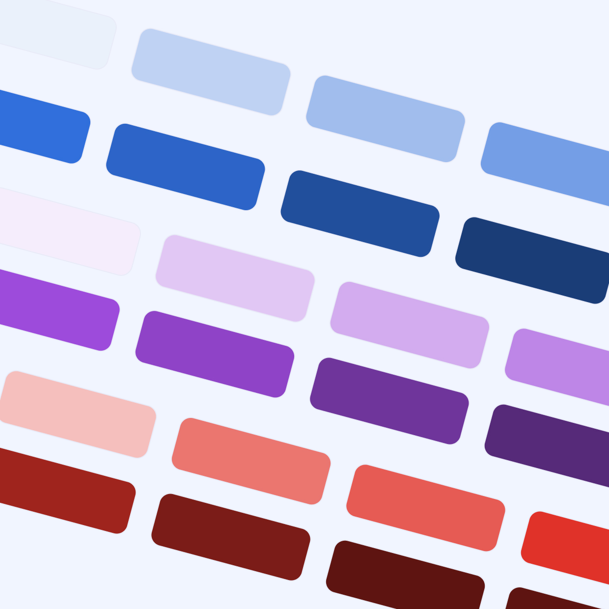
Before jumping into Figma, I researched any and all existing brand guidelines and other style guides for possible inspiration, paying special attention to colors. I noted that the brand blue and purple would be good for primary and accent colors.
With inspiration in hand, I set up the foundation. I chose to follow the principles of Atomic Design, a methodology I’ve successfully used in past enterprise systems (Atomic Design is a methodology that breaks down components into their smallest parts and builds up from there):
I started with the most important Electron: Colors.
It’s hard to overstate their importance. Colors define UI identity, communicate meaning (e.g., errors, success), and must comply with WCAG contrast accessibility standards.
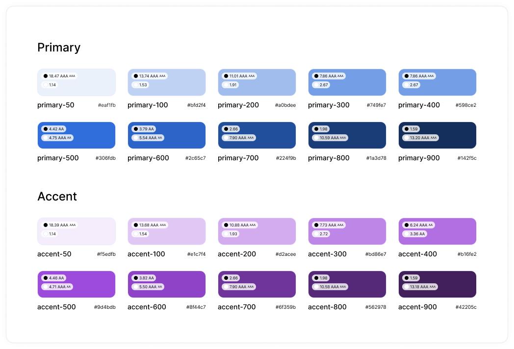
Each base color was chosen with accessibility in mind to ensure AA contrast with white text. I also defined a full spectrum for each, following the Angular Material 50-900 scale, since our devs were using that framework.
For the foundation, I defined a full palette for the following colors:
Here’s a screenshot of the Primary and Accent palettes, complete with hex codes and contrast info:
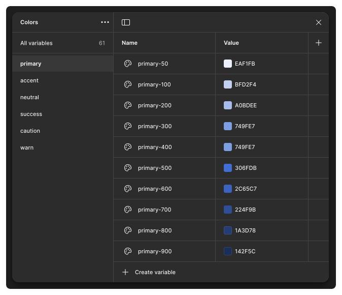
Importantly, these colors were created as Figma Variables instead of Color Styles. This gives us more flexibility, especially if we switch to semantic naming in the future. Here’s how they appeared in the Figma Variables panel:
In the interest of length, I’m going to focus only on the all-important Button component.
Following Angular Material conventions, I built a single Button component with the following variants:
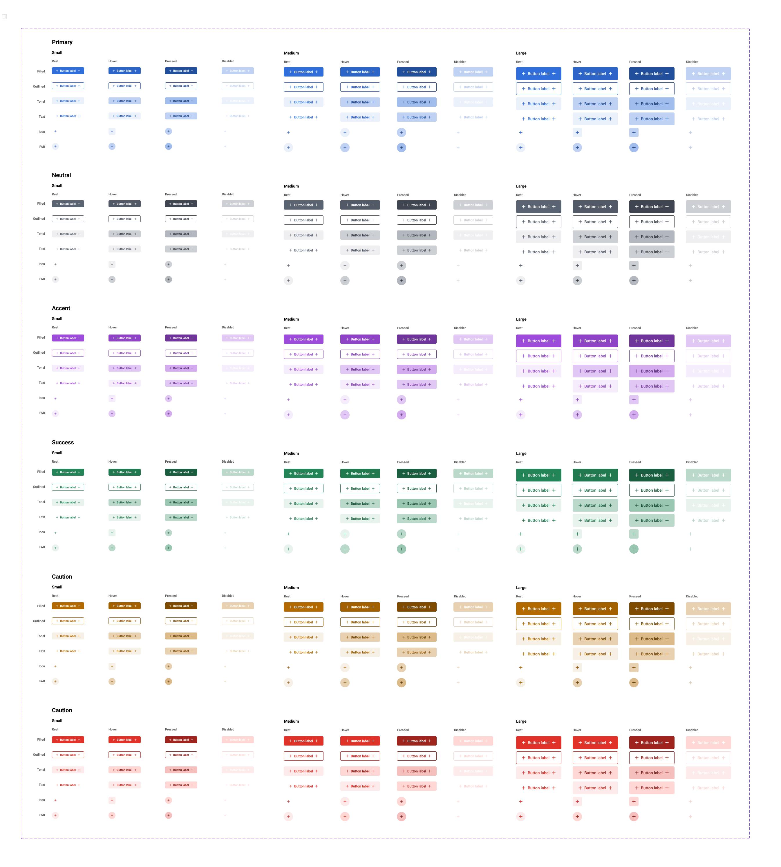
And here’s the different properties in action, showing how simple and fast it is to create different buttons:
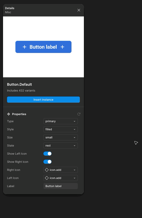
One more notes on the Button component: Text styles were aligned with size variants (e.g., “Medium” button used “Medium” text). I also built in interactive properties like hover states to ensure correct behavior in prototypes.
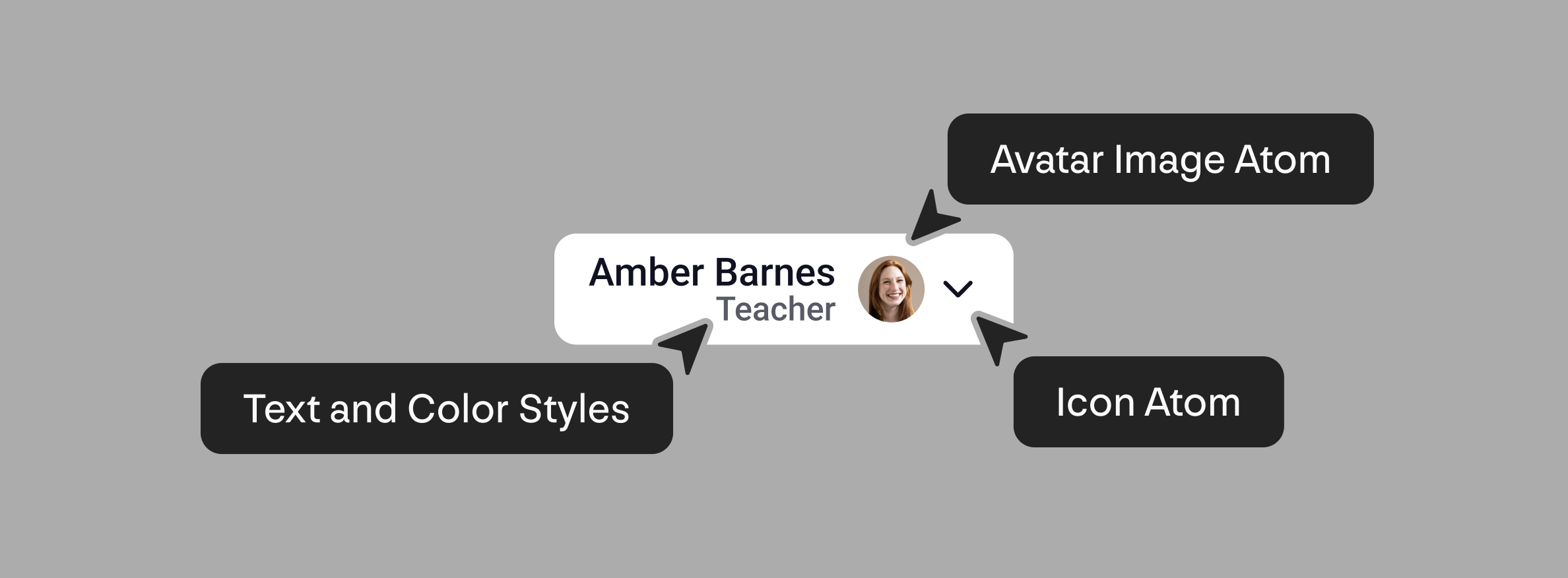
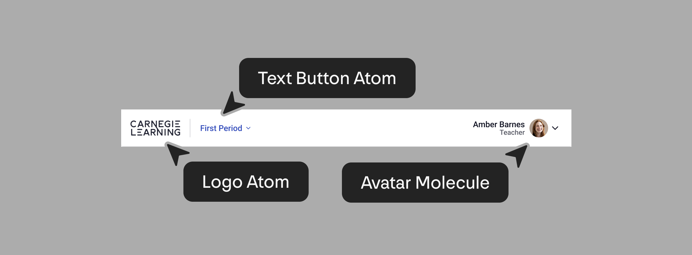
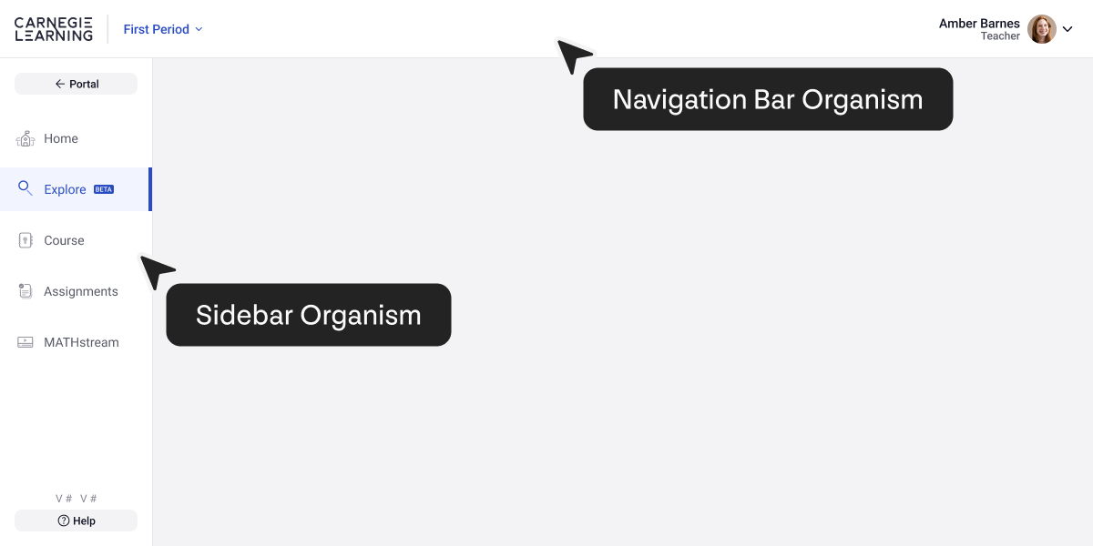
To keep things brief, here’s one example from each of the remaining levels:
Molecule: Avatar Button
Combined Avatar and Icon Atoms with text styles:
Organism: Navigation Bar
Combined the Logo and Button Atoms with the Avatar Button Molecule
Template: Side and Top Nav
Combined the Navigation Bar Organism with the Sidebar Organism
Equally important is making sure designers and developers know how to use it. They are essentially useless if they're not being used properly. This is what actually determines whether the system is successful or not, so a plan to teach and communicate is essential. So here's what I did:
Since the initial setup, the design system has never stopped evolving. It is a living thing.
With dozens of custom components and hundreds of variants, it has dramatically sped up the design process. Just as importantly, designers no longer spend time recreating UI elements and can instead focus on designing the experience.
On the development side, it provided a reliable source of truth. No more chasing down the latest specs. It even inspired the dev team to start building a matching Storybook library, keeping everything in sync.