• UI/UX Design
• User Research
Within Carnegie Learning's Learning Management System, the Search page is where teachers find supplemental assignments for their students.
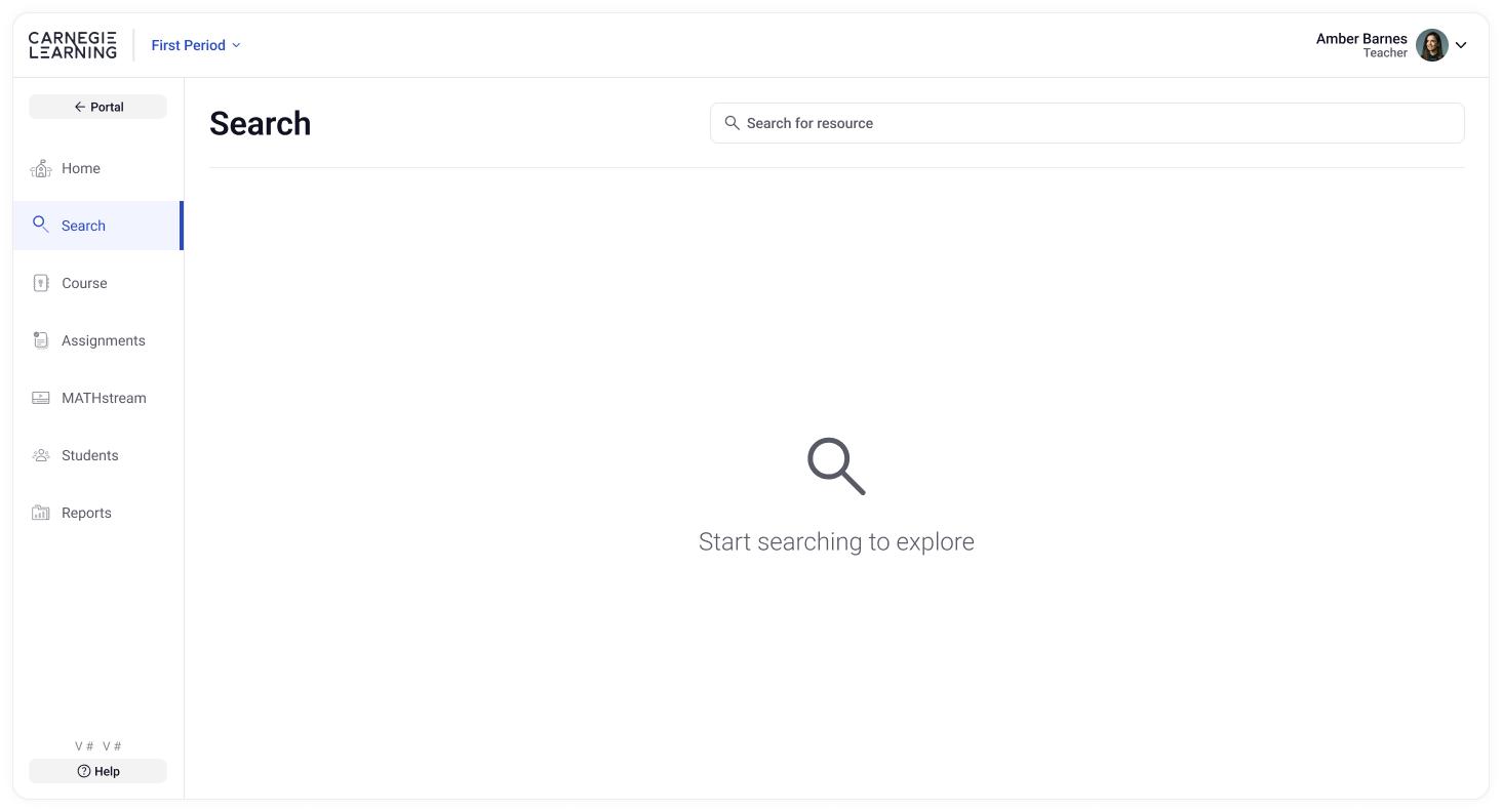
The current Search page frustrated teachers because it was difficult to find resources. There was no discoverability. How could I make this a more engaging and useful tool for teachers?
Starting with user research, I discovered what exactly teachers wanted. I also researched our internal capabilities and limitations. Based on that, I delivered an end-to-end solution that reshaped product strategy and made the Search page more engaging and useful.


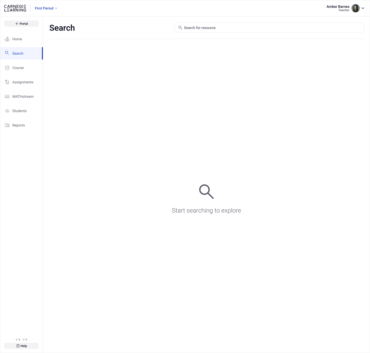
Because the initial Search page initially contained nothing more than a large empty search field and vague instructions, it was difficult for teachers to quickly find what they were looking for, or even where to start. See it below:
Like any project, I try to understand user needs and any technical or business limitations before I fire up Figma. So first, I began by working with the UXR team to determine the pain points and needs of teachers. We determined that teachers wanted:
• More discoverability
• The option to browse by state standards
Then I started researching how the curriculum team organized the resources. For example, what data or meta data could possibly inform how I organize this new Search experience? Maybe it would reveal valuable way of presenting content to the teachers?
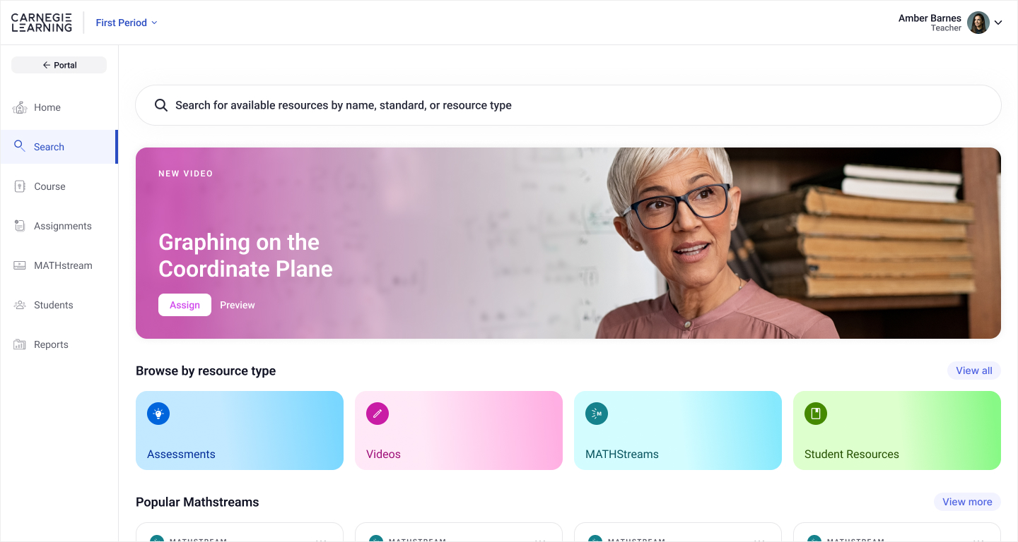
And it did, in fact. In addition to being pre-categorized by Resource Type (such as Assessment, Video, Game, etc.) and State Standards, each also came with a publish date, so I could also surface the latest resources to teachers, which I believed would be useful. In addition some types, like Math Videos, for example, had student ratings, which meant we could present "Popular" items.
These are good examples of how doing proper and thorough research can help shape product strategy because the idea of showing "new" or "popular" resources hadn't been in any initial requirements.
I always like a quick sketch to get an idea out of my head just to confirm what I'm visualizing makes sense. Knowing that the categories would be the basis of my designs, I started sketching. In my head I envisioned other popular Search experiences, like one you'd find on an App Store, for example, and tried to quickly layout a Carnegie Learning version of that. Here's the first sketch:

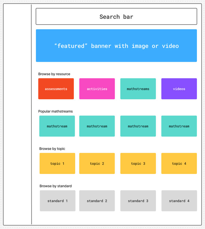
After a few more sketches to refine and add a little more detail, I put together a rough version using Figjam to share with my PM and other designers on my team. During this phase, I realized that a "featured" banner across the top would be a good idea. Why? It would visually balance the page and be a dynamic, eye-catching element to promote certain content.
Beyond that, the goal was to flesh out the design a little more for feedback on the UX and structure before the nitty gritty of hifi designs. Here's that Figjam:
After getting the thumbs up, along with some minor feedback, on the overall structure, it was finally time to fire up Figma and start hifi designs. Using as many existing components as possible from our design system (which I also created and manage), I created the first iterations of the design. After a few rounds of feedback from stakeholders, I delivered the final design:
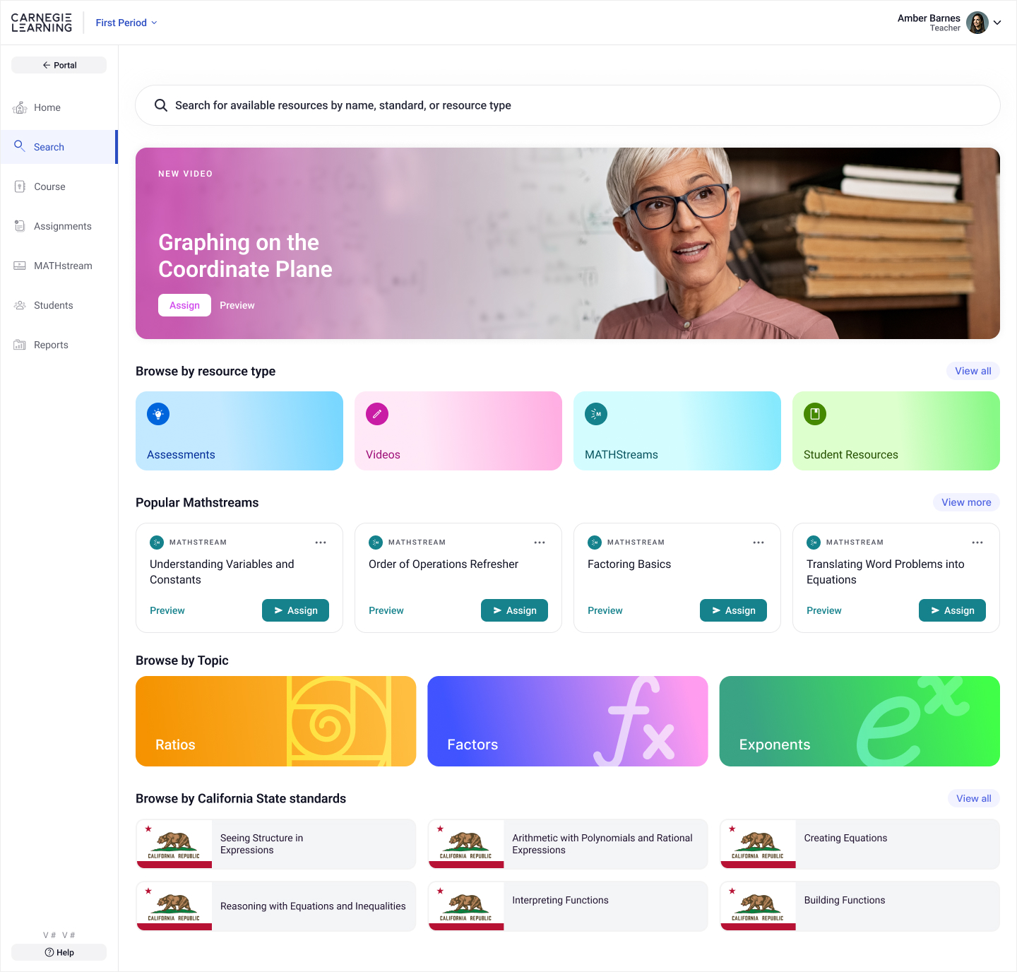
The new design is colorful and energetic, inviting users to browse curriculum content through smart categories like "Popular" and "New" to find relevant content. It features a dynamic, eye-catching banner to highlight key content. The browsable UI, with helpful sections like Resource Type, Topic, and Standards, makes it easy to navigate because it follow familiar patters users are used to.
In addition, teachers can still search using the search bar at the top, but now the instructions are much clearer and more useful.
Drag the handle below to see the transformation from old to new:
This case study just scratches the surface of the time and effort that went into this design, but it shows how a holistic approach of understanding user needs and proper research can not only result in a better UX, but actually positively affect the strategy of the product.
Before handoff, I also worked with the UXR team to test the new design using interactive prototypes with teachers. The results were extremely positive. Users said the new design was:
• Visually engaging
• Fun to use
• Much more useful