• UI/UX Design
• User Research
QualBoard is a flagship market research app under Sago, a top global market research company. Thousands of users use it to conduct “online focus group” events, which mainly include text-based and video-chat events.
The UI/UX was outdated, having not been updated in several years despite frequent user feedback. How can I refresh the design while ensuring it stays useful to users?
Working closely with the PM and stakeholders, I led the complete redesign of the product, pausing throughout to conduct in-depth user testing, resulting in a fresh and polished UI that users loved.


I worked closely with the product manager on developing a plan for the redesign effort. QualBoard is a massive, complex app, so this was a going to be a huge undertaking and having a plan in place would be crucial to a successful result. Our plan consisted of iterating on wireframes internally before testing hifi designs with actual users throughout the entire process.
I couldn’t begin work on the UI/UX until I had a complete understanding of the app and its users. So I began with interviewing the different users of the app, from research experts to other internal employees to panel participants. This was invaluable to the redesign. Here are a few examples of major pain points I learned:
• Navigation wasn’t intuitive
• Quickly getting to "events" isn’t possible
• Design felt outdated
For example, here is what the user would see right after logging in, a basic table listing the user’s projects:

Events, the main feature of the app, live in projects. This view forces the user to click into a project before seeing their event, which was a major pain point.
At the same time, I spent several days thoroughly reviewing competitors and how they tackle similar use cases. This included learning all I could about the market research industry as a whole.
With a solid understanding of the app and our goals, I was able to start sketching out the new UI for the home screen. Based on the feedback, I knew the redesign needed better navigation and quicker way for users to get to their events, which currently requires at least three clicks to get to. So I knew I wanted to implement a sidebar navigation and home screen that featured both one-click access to projects and events.
Here are a couple early sketches:


I pitched the second sketch because it better visualized the hierarchy between projects and events.
With any major redesign, there are going to be trade-offs. In this case, the new design would show fewer projects than the previous version. But this trade-off was worth it for two main reasons:
• The new design now shows events (which live inside projects) instead of just projects. Users wanted the ability to see recent events without having to click into a project, so that need made the trade-off worth it.
• Second, we found most users had less than four active projects at a time, so most users wouldn't need a long list of projects to begin with.
I then moved directly to high-fidelity designs in Figma. Here's the home screen:
So many upgrades. A few highlights:
• The sidebar navigation features quick access to the user’s events that were happening today. Based on feedback, users wanted to be able to get to these “live” events quickly. This solves that.
• The sidebar also includes one-click access to any active projects for the user. Before, they were presented with a list of all projects, no matter if they were active or not. This is a smarter way to do it.
• Now, upon logging in, the user is presented with a clear look at their projects and events in one single view. They can easily and quickly get to either with just one click.
Drag the handle to see the transformation from old to new:
With such a big change, and even with the constant user testing throughout, we still needed a plan in place to ease users into the new experience.
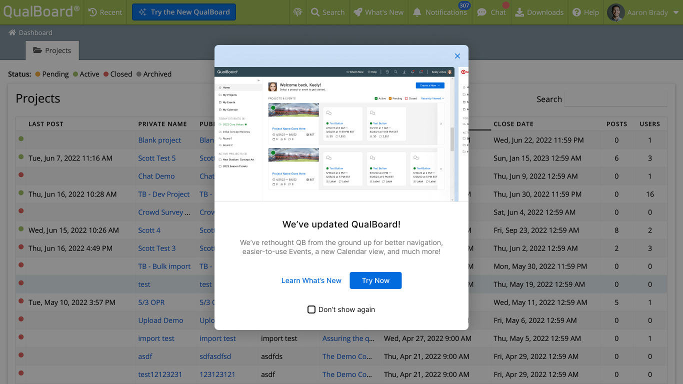
So for a few months, users would have the option to keep using the old version while being able to try the new one:
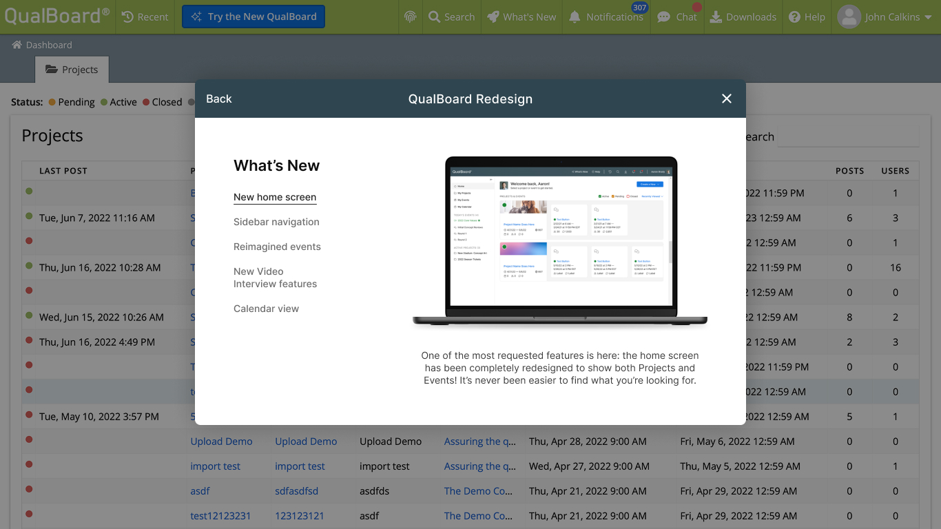
And a detailed What's New modal:
During the design process, I also created prototypes to test different user flows. Here's one example, which shows the UX for adding a banner to a project:

This case study barely scratches the surface of the time and effort that went into this. Hundreds of redesigned screens and interactions. A new login/onboarding experience. And of course mobile versions of each.
Based on user testing, the redesign was a huge success and users couldn't wait to use the refreshed product. In fact, 100% of users tested preferred the new design.