• UI/UX Design
• User Research
Students, from kindergarteners to high schoolers, needed a custom drawing tool to complete math assignments.
Initial design solution was too complicated for students, especially those in middle and elementary school. How can I design a solution for such a wide range of students?
Working closely with the PM and developers to ensure feasibility, I proposed, then delivered, a solution of three versions of the drawing tool. Each would have gradual levels of complexity depending on the age group, but functionality would remain as consistent as possible to keep development speedy.


The first problem was that initial rough concepts (done by a designer who had since left the team) were too complicated for students, especially younger one. Here's how it looked:
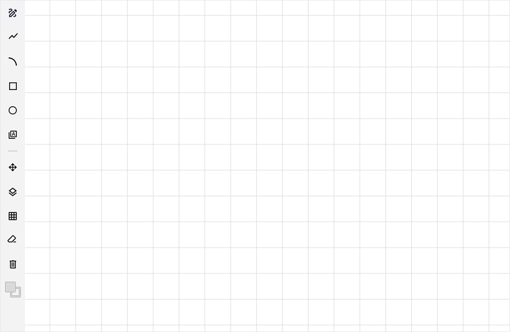
It was clear to me instantly that we needed less Photoshop, and more fun. Kindergartners, for example, would have no idea how to navigate this UI.
But that lead us to the second problem: we didn’t need just one experience. Since high school seniors’ needs are so vastly different than a first grader’s, for example, we’d need experiences for different age groups. Stakeholders and SMEs agreed, and we worked together to determine how the age groups should be broken up:
• Kindergarten – 2nd Grade
• 3rd Grade – 5th Grade
• 6th Grade – 12th Grade
Wouldn't designing and building three different experiences cost more development time? Yes. But is there a way we could limit it? Also yes.
I proposed keeping the functionality the same throughout each tool, but as we got younger, some functionality would just be hidden. So essentially one tool with certain functionality removed depending on the age group. With this solution, we were able to get it slotted for development.
I knew I wanted to make the design more simple and fun. So I researched other drawing tools, and found inspiration from drawing apps on tablets. After all, student of all ages were likely familiar with them. It seemed like an obvious place to start.
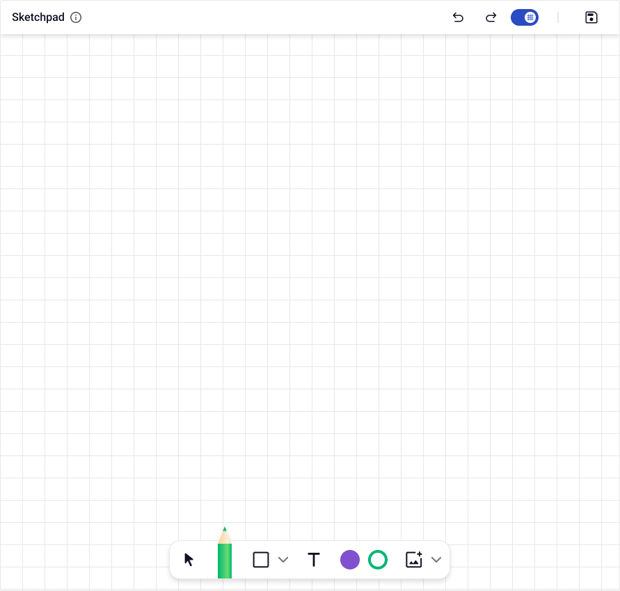
Since the 6th-through-12th grade version would have the most functionality, I started with that one:
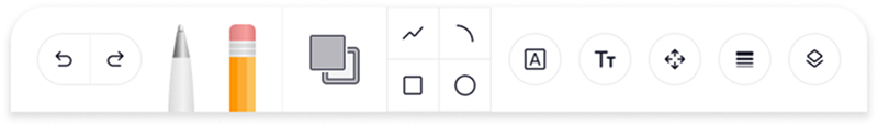
It was a decent start, but it still felt a little too complicated and too big. After a few more iterations, this is the final version of the 6th-through-12th grade version:
This version kept it as simple as possible, with the most common tools (based on the assignments they’d use the tool for) at the forefront. It also was much smaller so there is as much space as possible for the drawing area, and was easy to use on both computers and touch-first tablets.
Essentially, I turned the generic left toolbar into a more fun and compact version that could be styled for different age groups. Here's how it looked within the actual tool:
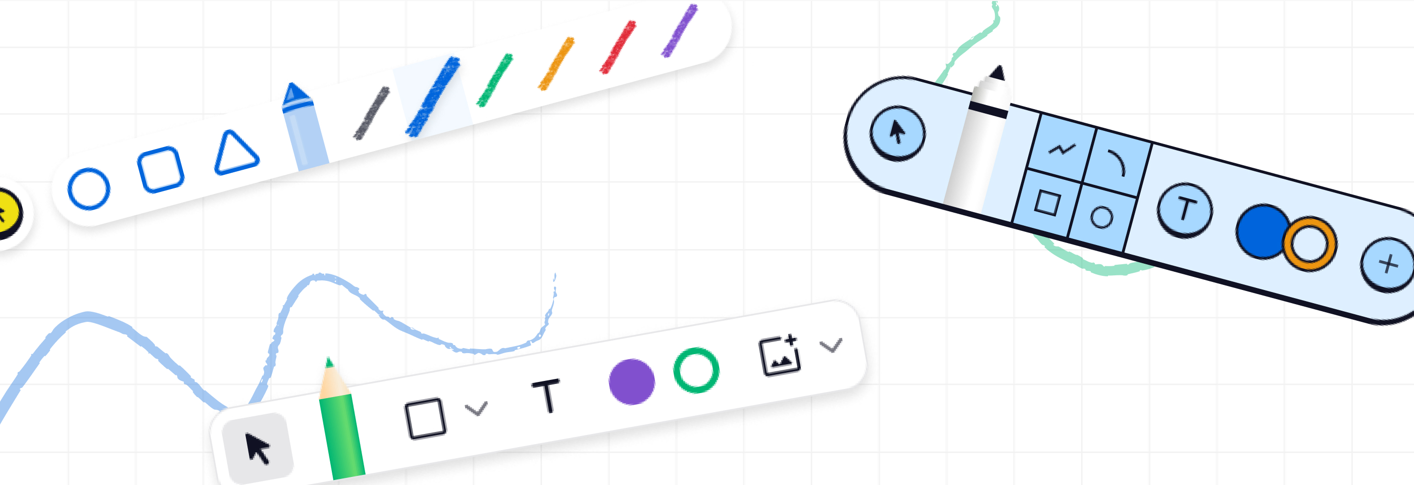
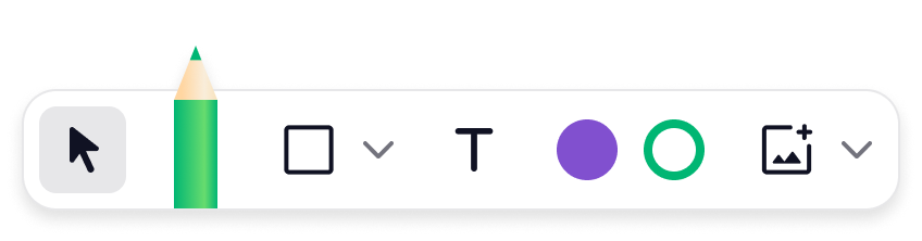
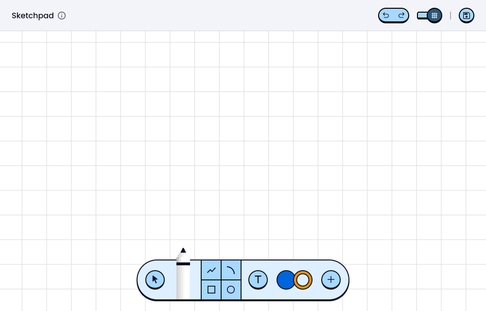
It was now time to work on the first elementary design. Given the younger users, I decided that all controls should be visible while still keeping it as compact as possible.
Visually, I used colors and styling from our existing elementary product so it felt consistent and familiar to students. Here’s the final design:
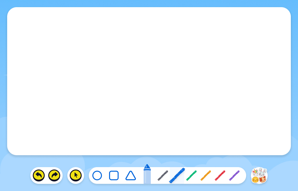
This would be the most “different” version because it needed to be touch-first as most students this age would be using iPads or other tablets when using the tool.
Visually, it needed to feel fun and engaging with big colorful buttons and a simple layout. Here’s the final version:
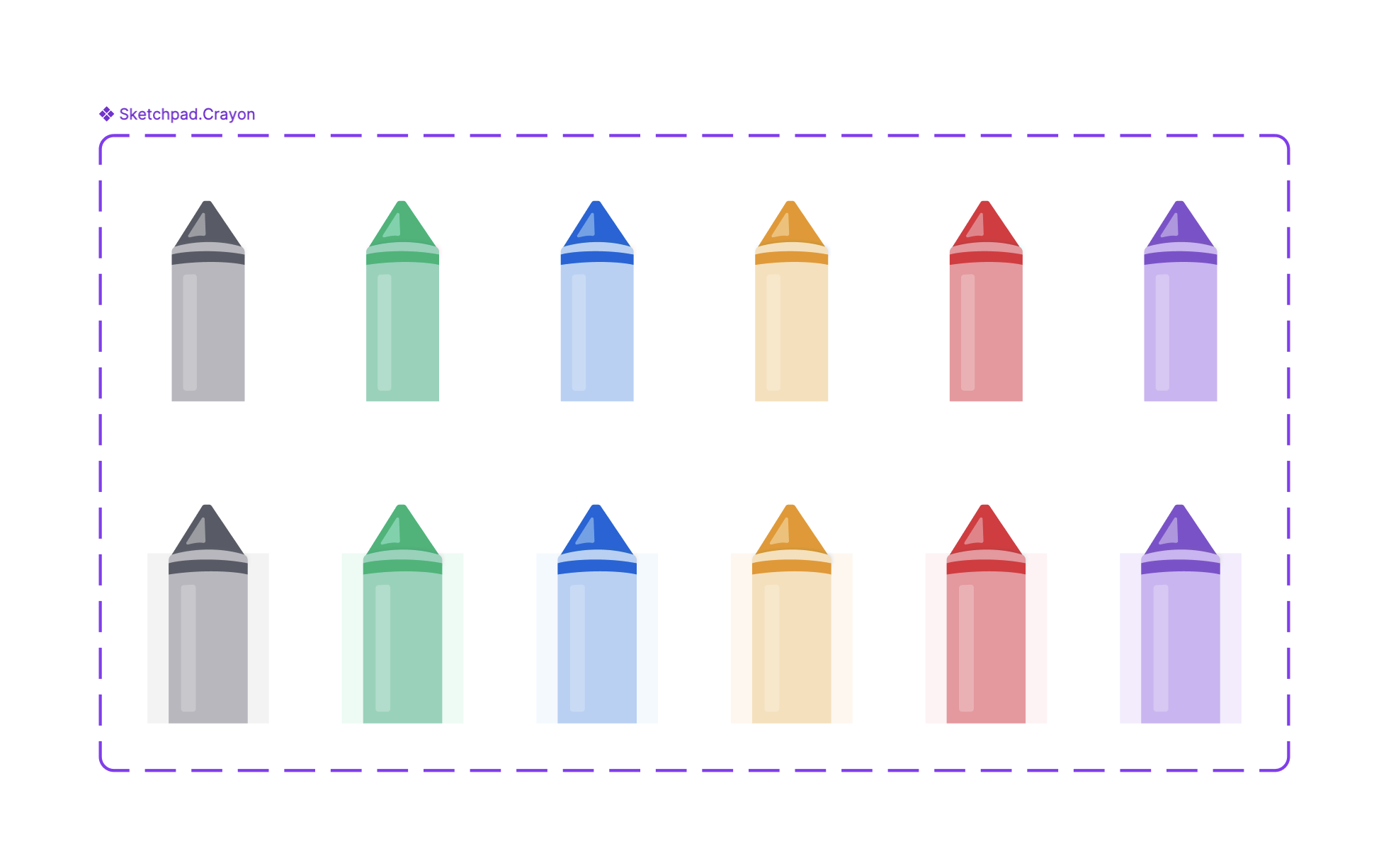
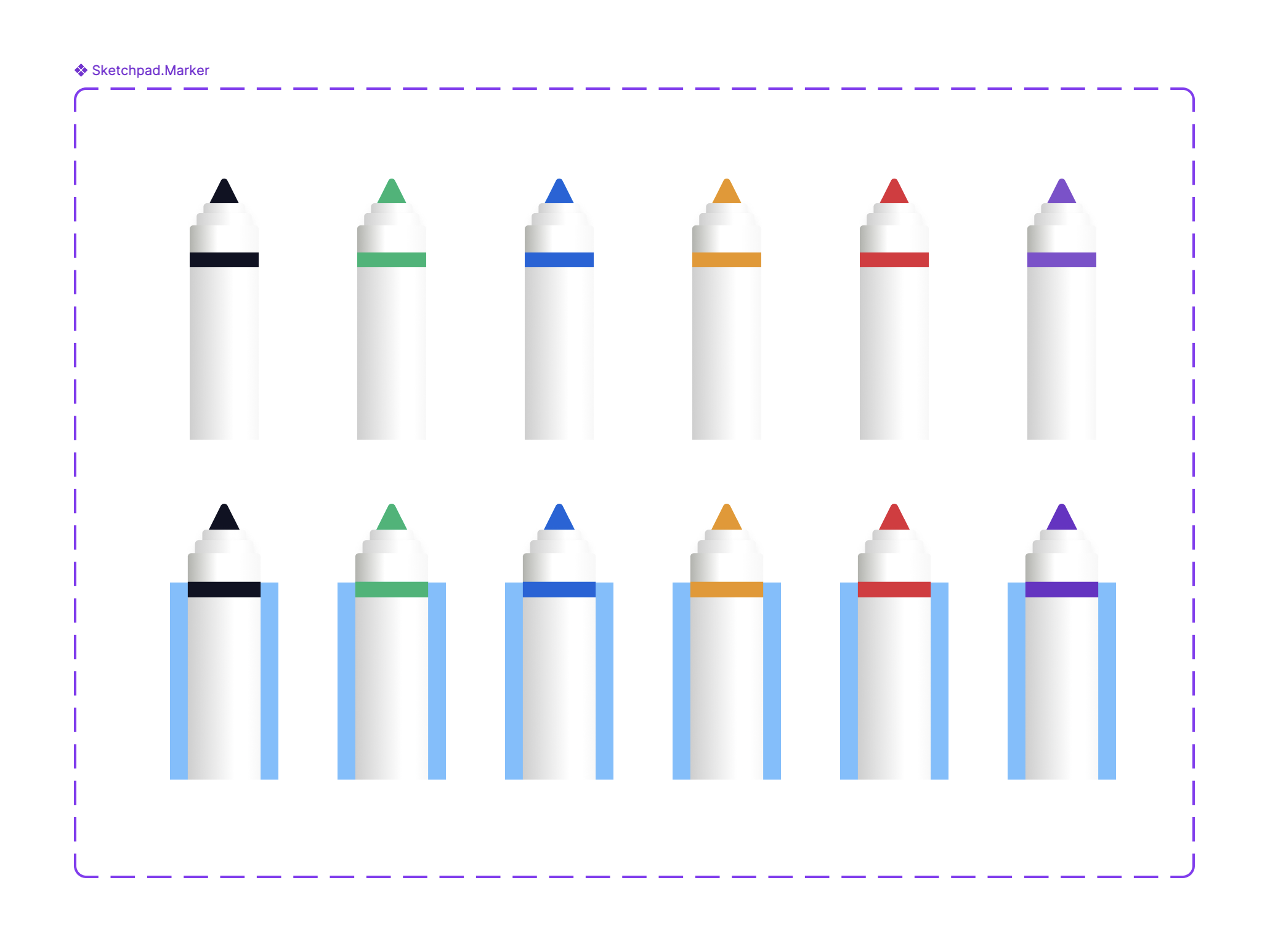
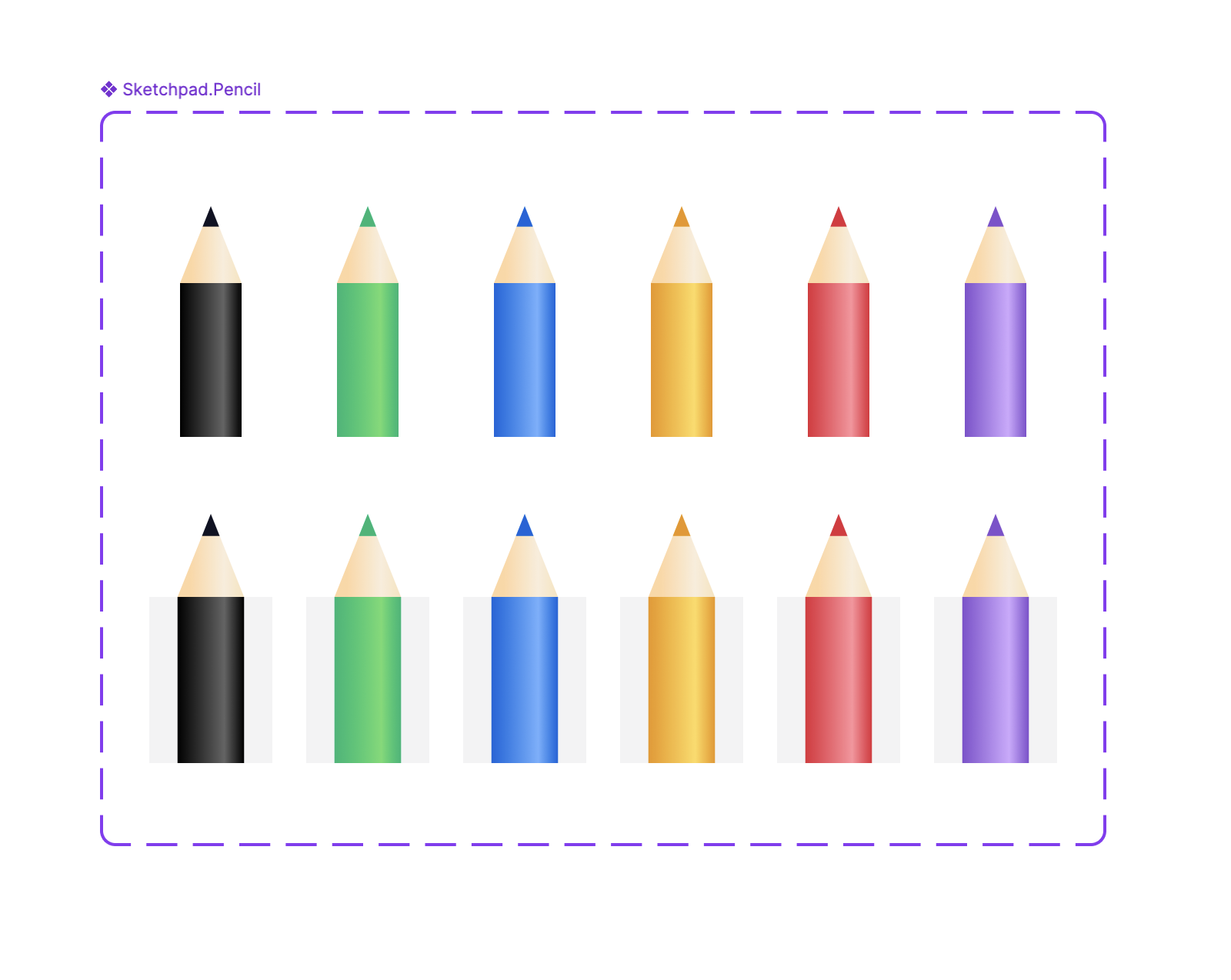
I also custom designed each icon from scratch using Figma, which included the pencil, marker, and crayon illustrations, and turned them into interactive components:
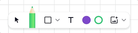
For each version, I also created interactive prototypes for user testing and stakeholder reviews. Here's an example of the hover states within the 6-12 version:
The finished result shows how thorough and thoughtful research and design can impact product strategy. Before I started, the plan was one tool for the entire student base. With my input, we ended up with a much better UX for students.
Based on user testing, students loved the new designs and found them fun and engaging to use. In addition, teachers would later report an increase in how fast the students were now able to complete questions that utilized the new drawing tool.
Lastly, the tools were so successful that they were used as the basis for new custom annotation tools for students.